This was a bit of fun! And a bit of a weird one too.
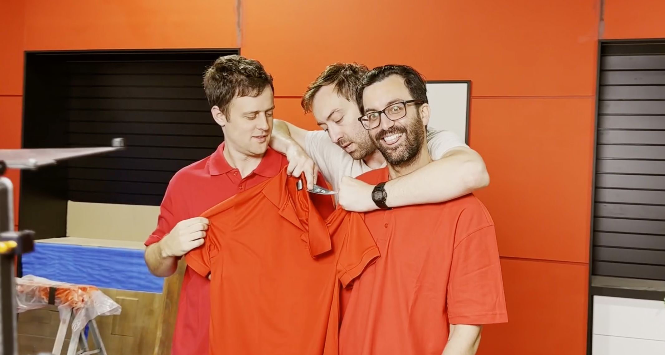
Since the new Bored set has red on the walls, we need to make sure our shirts don’t clash!
So we got to try on a whole bunch of red shirts for a bit of amateur modelling. We can’t wait to film in this set in a few weeks time!


What about putting epaulettes to help frame the shoulders?
Maybe make the shop theme military, or one of the forces specifically?
Now that is an interesting one. I would have thought that a darker red would allow for more contrast?
Very interesting to see Rowan in a red shirt again…. I wonder why he needs to try one on……?
Beecause he’s a model.
Congratulations, you win the internet today XD
Yes darker… it could be burgundy or vermilion or ruby or garnet or russet or ochre shirts (I’m running out of synonyms :p)
I can already see employees hiding “in” the wall with a shirt that has the same colour. 😀
I’d love to see that!
oh that’s gotta be a thing for a karen video.
I do think a model competition sketch should be in the works…
One step at a time. Can’t wait to see it all come together.
I’m so glad that I bumped my kickstarter kevel to be able to see these updates. Pure gold.
Ok, but why was Rowan testing RED shirts? Yes he is a model, but RED SHIRT??? Blasphemy!
He should just be glad Alan isn’t modelling a White shirt. 😀
true…
To be fair, he started with the red shirt and Alan had the black shirt… but he asked to switch.
Easy solution, ‘promote’ everyone to black shirt, and Rowan to white shirt of course. 🙂
I like the one that almost matches. It makes the Red Shirtted peasants vanish, and get absorbed by the store.
It lends itself to themes of the employees being insignificant cogs, and to skits of customers being unable to locate an employee who’s standing right next to them
ErathiaForever, I like the idea of customers not being able to see employees because they blend into the wall!
Absolutely, camouflage skit!
“get absorbed by the store”….this definitely gives me the Davy Jones curse vibes and I love the idea of Alan, Adam and eventually Ellie merging into the walls if there are no customers or empty shelves….
I love that idea!
Maybe you should make the ‘Red Shirt’ the same colour as the blue in your logo. Then Rowan can still be a ‘Black Shirt’.
Or repaint the Bored set Blue…?
Ah the finer details… hope you all find the one you’re looking for! Although you could do a chameleon episode where Rowan thinks he’s invisible?
I really like the red one….or maybe the red one, but not the red one….oh I just can’t decide!
Is the wall suppose to be orange? either way, none of those really work in contrast.
It really does look orange on my screen. And the “bluer” red shirt that Adam pointed out looks like primary red to my eyes.
So… why paint the walls red?
I’d call the Bored set more of a tomato red.
Hi! Any new ETA on the videos for the Kickstarter backers? Thanks!
The wall looks orange regardless of the color of the shirts. Something weird going on with the lighting or possibly the sheen of the pain reflecting color from behind the camera.
The orange-ier warm red (or tomato as someone called it) is on-brand to your new “store” because it matches the walls and, presumably, product packaging and such. Stores don’t just have any shade of red or blue in their uniforms, they match the logo and paint scheme of the store.
If the too-close color causes a problem during filming (cameras losing focus, for instance): After Rowan “loses” his employees a few times by them blending into the walls, a black or white yoke or piping or other trim could be added?
I like the red blue one. Needs less blue though. Maybe bring back the white shirt to end all of the frustration. Who knows where that will lead…
I hope they match perfectly, so you can do a skit about hiding from the boss when he has an unpleasant task to hand out, and one of them hides against the wall 🙂
I’m sad there wasn’t a modeling comment… also I wish for the kickstarter rewards the red shirt was an option! That would’ve been awesome. Keep being amazing VLDL! 🙂
I can’t recall, but when was the update gunna be for the mural wall??
The walls to me are more of a orange red or just burnt orange in the video. Red is so hard to make true red on camera, it’s like a filter system, but digital. The eye naturally sees in 4-8k depending on movement, so I feel for you guys and this difficult time to find a true red shirt that compliments the walls! Thank you for taking the time and remembering the small details!
This should be an episode of Bored
Sorry, Adam, but that shirt is redder, not bluer. LOL. The redder shirts look better, by the way.
Here’s an idea. Change the color of the walls!
Stick with your gut. I have no whitty coment. Look forward to the new videos
The dark red was the best methinks.
Also, once you peasants FINALLY stock those shelves, it will be much easier to notice you regardless.
I would go the other way when the background is darker one or more faded color for contrast, but yeah a dark web ehm mode user here.
I’m a modeeel
The new studio really needs one of rowans casual fridays, ie nude fridays. Adam would get a kick out of it
I used to work in a QC lab at a paint factory so I definitely get all the colour shade stuff. I thought the Blue shade one looked best on camera.
Eww not the orange! Stick with the dark red shirts
End of an era
you should allow them to blend into the wall, so when Karen or another bad customer comes back they can stand against the wall and just .. shade away.
Either exactly the same colour as the walls, or completely different, maroon maybe, a slight shade difference would be really jarring. With hindsight maybe the wall and shirt colours should have been worked out togetherly. I am not being snide, nobody thinks of EVERYTHING, and I am the one who spent ages looking for my glasses today, while having them on my face! I am getting more and more excited the closer you get to completion, you have worked hard for your success, and you have a really loyal fanbase worldwide, not bad for three lads with a vague idea and the guts to make a go of it. There are other sites with a similar theme (D&D based, for example) but none with as varied and inventive content as your own. I never have, and prolly never will, become a patron of anything like this again, but your enthusiasm, creativity and commitment impressed me muchly. I still watch all your stuff on a regular basis – starting with Beached, which still impresses.
More Red! LOL
I want to stroll into the store and know what level of employee I’m dealing with.
In all seriousness though, probably a little bit shinier of fabric would help you not blend in with the walls as much.
If you get just the right shade, Rowan can camouflage himself against the wall, just waiting for an opportunity to say, “That’s a pay cut!”
I feel like you need a shirt version of the paint tabs for when you paint your house.
Why not Playtech red?
Because it is not Playtech anymore.
That Bored song slaps